Landing Page Anatomy: Every Section in Order, and Why
The exact landing page structure that converts: every section in order, why it earns its place, and a real UK example you can copy.
Key Takeaways
- A landing page has seven sections in a fixed order: headline, subhead, form, proof, what you get, FAQ, repeat call to action. Each one exists to answer a question in the visitor's head.
- The headline states the offer and the outcome. Your company name goes nowhere near it.
- One form or one button, above the fold, with the fewest fields you can get away with.
- What is missing matters as much as what is there. No navigation, no footer links, no blog links. A landing page is a corridor, not a lobby.
- A landing page and a service page are different animals. The service page keeps its navigation because part of its job is to rank.
- This structure is what makes paid traffic pay. Sending Google Ads clicks to your homepage burns money.
Almost every guide to landing page structure uses the same examples: American software companies, webinar signups, ebook downloads. Useful if you sell project management software in San Francisco. Less useful if you are a UK service business trying to turn clicks into enquiries.
So I am going to do this differently. I will walk you through every section of a landing page, top to bottom, using a real one we ran: a single-offer page with one form and nowhere else to go. For each section I will tell you what it is, why it sits where it sits, and the mistake I see most often when I audit other people's pages.

One rule before we start. A landing page exists to do one job: convert the person who lands on it. Every section either moves them towards the form or it gets cut. That rule explains the whole anatomy, and it sits behind everything we build under web design that converts.
1. The headline: the offer and the outcome
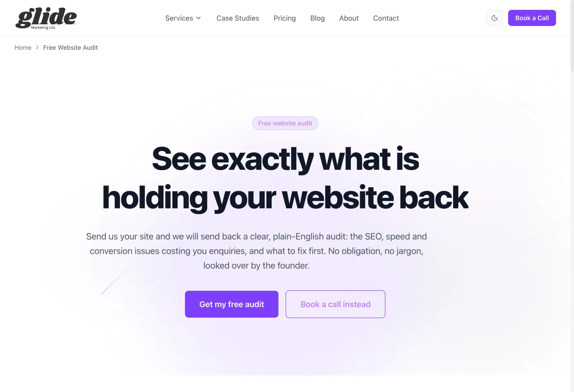
The headline is the first thing people read and, for about half of them, the last. It has one job: state the offer and the outcome it leads to.
On this page the headline was built around the offer and what you walked away with: a clear picture of what was costing your site enquiries. Offer plus outcome. A visitor knew within two seconds whether the page was for them.
Why it goes first: people decide whether to keep reading before they scroll. If the headline makes them work it out, they will not bother.
The common mistake: putting your company name or a slogan up there. "Glide Marketing: Digital Excellence Since 2022" tells the visitor nothing about what they get. Nobody arrives at a landing page wondering who you are. They arrive wondering what is in it for them. Answer that.
2. The subhead: who it is for, and the de-risk
The subhead sits directly under the headline and does two quieter jobs. First, it names who the offer is for, so the right people feel seen and the wrong people leave without wasting your time. Second, it removes the risk of saying yes.
For a low-risk offer, the de-risk is spelling it out: no obligation, and here is what happens next. You fill in the form, a real person reads it, you get a straight answer either way. Saying "what happens next" out loud matters. Fear of the unknown follow-up, the pushy sales call, the endless email sequence, stops a lot of forms being filled in.
The common mistake: using the subhead as a second slogan. "We help ambitious brands grow" de-risks nothing and qualifies nobody.
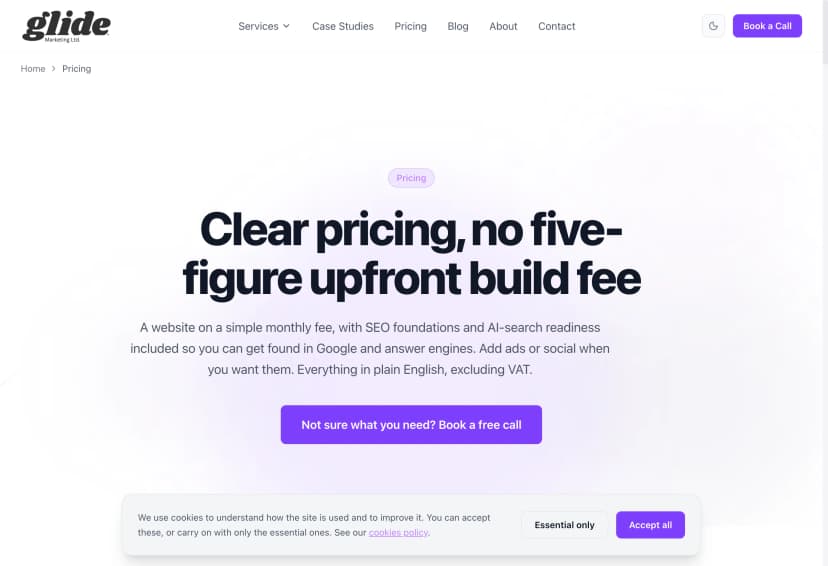
3. One form or one button, above the fold
This is the conversion point, and the rules are strict. One form, or one button. Above the fold, meaning visible without scrolling on both desktop and mobile. Minimum fields.
Ours asked for the essentials only: who you are, how to reach you, and which website the enquiry was about. Everything else can be asked later. Each extra field is a small toll booth, and some percentage of visitors turns around at every one. Budget dropdowns, "how did you hear about us", company size: all of it can wait.
Why above the fold: some visitors arrive already convinced, especially from a well-matched ad. Make those people scroll hunting for the form and a slice of them gives up. The form being visible immediately also signals what kind of page this is: an action page, not a brochure.
The common mistake: two competing actions. A form and a phone number and a "book a call" button and a brochure download. Every choice you add splits attention and lowers the total. Pick the one action you want, make it impossible to miss, and repeat it further down rather than offering alternatives.
4. The proof block: real numbers, real reviews, real names
By now the visitor understands the offer. The question in their head has changed from "what is this?" to "do I believe you?". That is why proof comes next, not later.
Proof only works when it is specific. Real numbers from real client results. Reviews with full names and businesses attached. A named person saying a concrete thing beats five anonymous five-star widgets. On our pages we show actual search growth charts from client sites and our genuine review score, because "trusted by businesses across Essex" on its own is wallpaper.
The common mistake: logos and stars with nothing attached. If your proof could be copied onto a competitor's site without anyone noticing, it is not proof. It is decoration.
5. What you get: the specifics
Vague promises kill conversions. "We will review your website" could mean ten seconds with a free tool or two hours of expert attention, and a wary visitor assumes the worst.
So the next section lists exactly what they receive: what happens after they submit, what they get back, and how long it takes. The visitor can picture the thing they are requesting before they request it. Picturing it is what makes the form feel safe to fill in.
The common mistake: describing your process instead of their outcome. Nobody cares that you have a four-stage discovery framework. They care what lands in their inbox and when.
6. Objection handling: the honest FAQ
Every visitor who has not converted yet is held back by a question they have not asked you. The FAQ section is where you answer those questions before they become exit reasons.
The trick is answering the real ones, honestly. "Is this actually free?" Yes, and here is why we do it. "Will I get a hard sell afterwards?" No, and here is what actually happens. "How long does it take?" If an answer is uncomfortable, give it anyway. An honest "this is not for you if..." builds more trust than a page of yes-men answers, and it filters out enquiries you did not want.
There is a bonus here too. Mark the section up with FAQPage schema and search engines can show your questions and answers directly in results. I wrote a full walkthrough in my plain English guide to schema markup.
The common mistake: FAQs written for the company, not the customer. "What makes you different?" is not a question anyone asks. "What does it cost?" is, and it is the one most pages dodge.
7. The repeat CTA, identical styling
The visitor who reads all the way down has just had their objections answered. Do not make them scroll back up to act. Repeat the call to action at the bottom: same wording, same colour, same button.
Identical is the key word. If the top button says "Get my quote" and the bottom one says "Contact us", that registers as a different action, and a small doubt creeps in about which one is right. Consistency reads as confidence. I covered the button rules, and the other fundamentals most sites get wrong, in my CRO basics post.
The common mistake: ending the page with something other than the action. A newsletter signup, social icons, a "learn more" link. The bottom of a landing page is the second most valuable spot on it. Spend it on the one thing you want.
What is deliberately missing
Now the part most guides skip, and where the biggest wins hide. Look at the page again and notice what is not there.
No navigation bar. No footer stuffed with links. No "latest from the blog". No social icons. The only clickable things on the page move you towards the form.
This is on purpose. Every link is an exit, and on a landing page exits have a price, literally so if the visitor arrived from an ad you paid for. Removing the navigation menu alone is one of the most reliable conversion improvements you can make, because it closes the escape hatches.
My shorthand: a landing page is a corridor, not a lobby. A lobby has doors everywhere and that is fine, because a lobby's job is to help people explore. A corridor has one door at the end, and the architecture itself walks you towards it.
This is also exactly why a landing page is not the same as a service page. A service page is a lobby on purpose. Its job includes ranking in Google, and to rank it needs navigation, internal links and connections to the rest of your site, because that structure is how search engines understand what the site is about. I broke that version down in the anatomy of a page that ranks. Same business, two page types, two different anatomies. The mistake is building one page and asking it to do both jobs. It will do both badly.
Where landing pages earn their keep: paid traffic
You can run a landing page for anything, but the place this structure pays for itself fastest is paid traffic.
When someone clicks a Google ad, you have paid real money for one visit from one person searching for one specific thing. Send them to your homepage and they land in the lobby: navigation everywhere, six services, a blog feed, and no obvious next step matching what they searched. Most leave. You paid for that.
Send them to a landing page built like the one above and the corridor takes over. The headline matches the ad they clicked, the form is right there, the proof answers their doubts, and there is nowhere to wander off to. Same ad spend, more enquiries. The page is usually the difference between Google Ads "not working" and Google Ads quietly printing enquiries, which is why the landing page is part of the job whenever we run Google and Meta ads for a client. Better pages also tend to earn better Quality Scores, which lowers what you pay per click. In regulated sectors the page does double duty, because it also has to carry the compliance detail the ad cannot fit: if you run a regulated firm, see whether IFAs can run Google Ads for how that works.
Steal the structure
None of this is theory. Headline with the offer and outcome. Subhead with the who and the de-risk. One form, above the fold, minimum fields. Specific proof. Exactly what they get. Honest FAQ. The same CTA again at the bottom. And nothing else on the page at all.
Open your own landing page next to this list and score it section by section. Most pages I look at fail on the headline, the form position and the navigation before we even reach the subtle stuff. If you would rather we built you one that gets it right, tell us what you need and we will go through it with you.
Mike McDonnell, Founder of Glide Marketing. More about how I work.
Frequently asked questions
What is the correct landing page structure?
Top to bottom: a headline that states the offer and the outcome, a subhead that says who it is for and removes the risk, one form or button above the fold, a proof block with real numbers and names, a specific list of what they get, an FAQ that answers the objections honestly, and a repeat of the same call to action at the bottom. No navigation, no footer links, no blog links.
What is the difference between a landing page and a service page?
A landing page has one job: convert the visitor who arrives on it, usually from an ad or a specific link. So it strips out navigation and every other exit. A service page has two jobs: convert visitors and rank in Google. It keeps the navigation and internal links because search engines use those to understand and rank the site. Same business, different anatomy.
Should a landing page have navigation?
No. Every link in a navigation bar is an exit, and on a landing page exits cost you money, especially if you paid for the click. Removing the navigation menu is one of the most reliable conversion lifts there is. Keep your logo, but make it plain text or unlinked. The only clickable things on the page should be the call to action.
How long should a landing page be?
As long as it takes to answer the visitor’s objections, and no longer. A free, low-risk offer can convert on a short page: headline, subhead, form, proof, FAQ. A bigger commitment like a £350 a month service needs more proof and more objection handling, so the page gets longer. Length follows the size of the decision, not a rule of thumb.
How many fields should a landing page form have?
The minimum you genuinely need to follow up. For most service businesses that is a name, an email and the website or postcode the enquiry is about. Every extra field gives someone a reason to stop, and you can ask the rest later. If sales insists on more fields, make them prove each one earns its place.
Why is my landing page not converting?
When a page is not converting it is nearly always one of four things: the headline talks about the company instead of the offer, the form is below the fold or asks for too much, there is no specific proof so the claims feel empty, or the navigation is still there giving people somewhere else to go. Fix those four before you touch colours or fonts.
Do landing pages work for local UK service businesses?
Yes, arguably better than for anyone else, because most local competitors send ad traffic to their homepage. A plumber, accountant or agency in Essex running Google Ads to a proper landing page is often the only one in the auction doing it. Same ad spend, more enquiries, purely because the page has one job and does it.