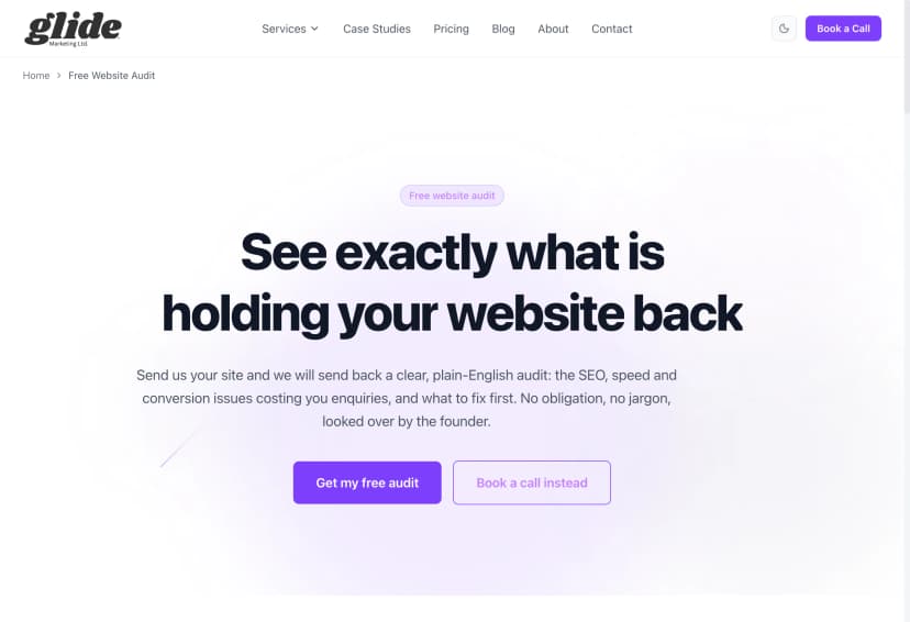
CRO Basics Most Websites Get Wrong (And How to Fix Them)
Most websites fail on CRO basics long before A/B testing matters. One CTA, no leaky links, real proof. Here is what I fix on client sites every week.
Key Takeaways
- Most CRO advice online is enterprise A/B testing talk. Small business sites fail on basics long before testing matters.
- One primary call to action per page. Every extra competing ask cuts your conversions.
- Style your main button identically everywhere. Visitors learn "the purple button = book a call" once. Never make them relearn it.
- Money pages should have almost no exit links. Every link out is a door out of the sale.
- Put real proof above the fold, ask for the minimum in forms, say your price, and make the page fast on a phone.
- You can audit all of this yourself in ten minutes. No tools, no subscriptions.
Search "conversion rate optimisation basics" and look at what comes back. A/B testing platforms. Heatmap tools. Multivariate testing. Statistical significance. Personalisation engines. All of it written by software companies whose product happens to be the answer to every question.
Here is the problem: that advice is built for sites with hundreds of thousands of visitors a month. A/B testing needs serious traffic before it tells you anything. If your site gets 800 visits a month, a test on your contact page would take the best part of a year to reach a reliable answer. You do not have a testing problem. You have a basics problem.
I fix these mistakes on real client sites every week at Glide. The same handful, over and over, on sites built by proper agencies that charged proper money. None of them need software to find. All of them are costing the owner enquiries right now.
These are my rules. Here they are, in the order I check them.
Rule 1: One primary CTA per page
Decide the ONE thing you want a visitor to do on each page. Book a call. Request a quote. Buy the thing. One.
Most sites I audit ask for five things at once. Book a call, but also download the brochure, but also follow us on Instagram, but also sign up to the newsletter, but also read our blog. Every extra ask competes with the main one, and every competing ask cuts your conversions. The visitor has to make a decision about which decision to make, and people who are made to think that hard usually pick the easiest option: the back button.
This is the single most common conversion killer I see, and the cheapest to fix. You do not need to build anything. You need to delete things, which is why nobody does it. Deleting feels like losing work you paid for.
The fix: pick the one action per page. Repeat it as often as you like (top, middle, bottom is fine), but make every other ask quieter or gone. If something genuinely needs a second action, like a phone number for people who hate forms, make it visually secondary. One loud ask, everything else whispers.
Rule 2: Make the main CTA the biggest thing, and style it identically everywhere
Your primary button should be the most prominent element on the page. Not tied with the logo, not competing with a stock photo of people shaking hands. The biggest, clearest, most obvious thing.
And here is the part almost everyone misses: style it identically every single place it appears. Same colour, same shape, same size, same wording. Visitors learn "the purple button = book a call" once, in about half a second, and from then on they can act without thinking. That is exactly what you want. Buying decisions die when people have to think about the mechanics.
Inconsistent button styles are everywhere and they quietly kill trust. A green button in the hero, a white outlined one mid page, a blue one in the footer, each with different wording for the same action. Every variation forces the visitor to re-check what they are clicking and whether it does the same thing. It reads as sloppy, and sloppy reads as risky.

The fix: define one primary button style and use it for the primary action only. Nothing else on the site gets to wear that style. If your pricing button, your contact button and your "learn more" link all look the same, your visitor cannot tell the sale apart from the small talk.
Rule 3: Plug the leaky links
Every link on a money page is a door out of the sale. Your service pages and landing pages exist to move someone towards an enquiry. A link to your blog, your Instagram, your awards page, or a "you might also like" widget gives them somewhere easier to go than your form. And they take it. People always take the easier door.
I call these leaky links because that is exactly how they behave. You pay for traffic, or you earn it through months of SEO, and then the page leaks it back out three links at a time.
The nuance that most advice skips: different page types have different jobs. Blog posts should link generously, that is literally their job. They build topical authority, pass strength around the site, and guide readers to the next step. I wrote a whole post on internal linking strategy making exactly that case. But a landing page is not a blog post. A landing page has one job, and every exit link is working against it.
The fix: on money pages, strip the links down to nearly nothing. Navigation can stay (hiding it entirely feels like a trap), but cut the in-content links, the related posts, the social icons, the footer link soup. On a paid traffic landing page, be even more brutal: the CTA and almost nothing else. I break down the full structure in landing page anatomy.
Rule 4: Proof above the fold
Real numbers, real names, real reviews. Before the visitor scrolls.
"Trusted by businesses across Essex" is not proof. "We pride ourselves on quality" is not proof. Adjectives convince nobody, because every competitor uses the same ones. What convinces people is specifics: a named client, a real result with a number attached, a review with a face and a business next to it, a screenshot of an actual chart going up.
Most sites bury this. The testimonials live on a separate page nobody visits, the case studies are three clicks deep, and the homepage hero is a vague headline about passion. Meanwhile the visitor is sat at the top of the page asking the only question that matters: can I trust these people with my money? Answer it immediately or they will scroll, get bored, and leave.
The fix: put your strongest single piece of proof in or directly under the hero. One real number, one named review, one recognisable client. Specific beats plentiful. One concrete result beats a carousel of twelve vague compliments.
Rule 5: Forms, ask for the minimum
Every field you add to a form loses people. Not might lose, does lose. Each extra box is another bit of effort, another moment to wonder why you need it, another chance to give up.
I still see contact forms asking for full name, company name, phone, email, address, budget, how they heard about you, and a message. Eight fields to start a conversation. Each one was added because someone internally found it useful, and nobody ever asked what it cost in lost enquiries.
The fix: name, email, message. Phone if you genuinely ring people back. Everything else you can ask once they have actually enquired, which is a much better time, because they have already said yes to talking to you. Qualify on the call, not on the form.
Rule 6: Say the price
Hiding prices leaks trust. The theory says "get them on a call first, then justify the cost". What actually happens: the visitor assumes the worst, suspects the price depends on what you reckon they can afford, and goes off to a competitor who just says the number.
We publish our own prices at Glide, including the cheap end. It filters out people who were never going to buy, and it builds trust with everyone else before a word has been spoken. The enquiries we get arrive pre-qualified: they know roughly what it costs and they are still asking.
The fix: if you cannot publish exact prices, publish "from" prices or typical ranges. "Projects typically run £2,000 to £5,000" answers the question in the visitor's head and keeps them on the page. Silence answers it too, just not in your favour.
Rule 7: Speed and mobile
Slow pages bleed conversions before design even matters. Nobody admires your hero section while it is still loading. Most of your visitors are on a phone, plenty of them on patchy mobile signal, and every second of waiting peels a chunk of them away.
The usual culprits are boring and fixable: enormous uncompressed images, a video background nobody asked for, a page builder stacking twelve plugins, and forty third-party scripts for tracking tools nobody checks. None of this needs a developer genius. It needs someone to care.
The fix: compress your images properly (modern formats, sized for the screen they appear on), bin the autoplay video, and audit your plugins and scripts twice a year. Then test the result on a real phone, not your office wifi.
How to audit yourself in 10 minutes
You do not need software for any of this. Open your most important money page and do four things:
- Count the CTAs. How many different actions does the page ask for? The answer should be one, repeated. If you count four or five different asks, you have found your first problem.
- Count the exit links. Every link that takes someone away from the sale. On a money page you want close to zero outside navigation. If your service page has fifteen ways to leave, it is a corridor, not a destination.
- Check button consistency. Scroll the whole page. Does the primary action look identical every time it appears? Same colour, same shape, same words? If not, fix it today, it takes minutes.
- Load it on your phone on 4G. Turn off wifi and open the page like a real visitor would. Count the seconds. Watch what loads first. If you are bored before the form appears, so is everyone else.
Score badly on two or more and you have just found out why the enquiries are not coming. None of it needed an A/B test.
CRO and SEO are the same job done properly
One more thing, because people treat these as separate disciplines run by separate specialists. Traffic without conversion is decoration: a busy site that earns nothing. Conversion without traffic is a ghost town: a beautifully tuned page nobody ever sees. You need both, and the good news is the same clean structure serves both. One clear topic per page, one clear action per page, fast loading, honest proof, sensible internal links. Google rewards it and visitors reward it, because both are trying to work out the same thing: what is this page for? I have broken down that overlap in the anatomy of a page that ranks, and it is the thinking behind everything we build under web design that converts.
Fix the basics first
The CRO industry wants to sell you testing software, and one day, when your traffic justifies it, some of that has a place. But I have never once audited a small business site that was ready for A/B testing. Every single one failed on the basics above first: too many asks, leaky links, no proof, greedy forms, hidden prices, slow pages.
Run the ten minute audit. If you would rather I did it, send me the site and I will do it free, with a plain English list of what is costing you enquiries and in what order to fix it. And if you want it fixed rather than just diagnosed, that is exactly what our CRO service is for.
Mike McDonnell, Founder of Glide Marketing. More about how I work.
Frequently asked questions
What is conversion rate optimisation in simple terms?
Conversion rate optimisation (CRO) is making more of your existing visitors do the thing you want: enquire, book, buy. You do not need more traffic to get more leads. You need fewer reasons for the visitors you already have to leave without acting.
Why is my website not converting?
Nine times out of ten it is basics, not something exotic. Too many competing calls to action, exit links all over your money pages, no proof above the fold, a long form, hidden prices, or a page that takes five seconds to load on a phone. Fix those before you even think about A/B testing.
Do I need A/B testing software for CRO?
Not at the start, and probably not for a long time. A/B testing needs thousands of visitors per page to tell you anything reliable. Most small business sites do not have that traffic, and they fail on basics that do not need a test to spot. Count your CTAs and exit links first. That costs nothing.
How many calls to action should a page have?
One primary call to action per page, repeated as many times as you like. The repeat is fine, the variety is not. Five different asks on one page means the visitor has to choose, and confused visitors choose the back button.
Should I put prices on my website?
Yes. Hiding prices does not make people enquire, it makes them assume the worst and go to a competitor who says the number. We publish our own prices at Glide and it filters out bad-fit enquiries while building trust with good ones.
What is a good conversion rate for a small business website?
Across industries the average sits somewhere between 2% and 5%. But the benchmark matters less than your own trend. If your money page gets 500 visits a month and 3 enquiries, fixing the basics in this post will usually do more than any amount of testing.
How do I audit my own website for conversion problems?
Open your most important page and do four checks: count the different CTAs (want: one), count the exit links (want: nearly none on a money page), check every primary button looks identical, then load the page on your phone on 4G. If any of those fail, you have found your problem. It takes ten minutes.